What is a burrito without filling? A picture frame without a picture? A cone without ice cream? That is how important I believe a brand is to a cannabis dispensary. It is the foundation for the retail design process, and really, a fundamental element of any successful retail business. No matter how much you try to get around it—if a well-defined brand is missing, then you are lacking the substance that makes you, well you. A successful cannabis dispensary is driven by a mission, a purpose—a carefully considered and crafted brand.
So, what is a brand? For High Road, a brand is the personality, tone, style, business model, visual identity and signature assets of a company. Having a logo and saying your purpose is to provide a high-quality product is not the same as having a brand. A brand is more than a name or one logo. It is the suite of graphics, colors and typography that communicates across every customer touch point. It is a professional identity that puts a distinct signature on anything the company touches.
A well-defined brand also provides a clear-cut guiding principle, the compass if you will, for every business decision. And, it is your marketable differentiator. It is practically a religion that you and your team live by. A solid brand influences how your staff interacts with customers, what products you sell, the experience in the showroom and waiting in line, really every aspect of the customer journey at every touch point inside and outside of the physical dispensary.
In order to help you develop a brand that communicates the essence of your business, it takes a little self-reflection and careful consideration of many facets of your retail business, not just how you wish for your logo to look. When we start this process with our clients, the High Road team gathers information such as:
Who is your target audience? Soccer moms, patients, highly experienced connoisseurs?
- What is your position on quality and price? Affordable, accessible, premium?
- What type of setting do you want to provide? Recreational or medical? Discrete or bold? Open and browsable or consultative and one-on-one?
- What is the personality, tone and style of the brand? Will your playlist play dubstep or adult lite rock?
- What types of products are you focused on? Will you feature all craft brands and organic product lines? Is your focus on low-cost options or premium products?
We use the responses to these questions, and many more, to develop and refine the brand’s mission statement, brand statement and design brief as well as a style guide. These become the doctrine for how you go about implementing your brand across customer touch points.
When it comes to the design of your cannabis dispensary, a brand dictates the flow of your space, the color and finish palette, the architectural details and focal points, the tone of your communication as well as the experience of your clientele, employees, and vendors. It is not just about the customer, it is about how the employees engage, perform their work and represent the brand. It influences everything from the front of the house to the back of the house, including safety and security, product handling, order fulfillment and packaging.
To exemplify how a brand comes to life in brick and mortar retail, here are three dispensaries with three very different brand stories that dictate their various retail experiences.
Level UP
Differentiating Brand Position – Upscale Setting & Exceptional Service
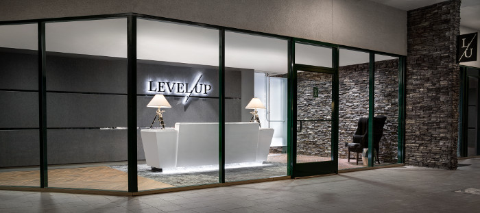
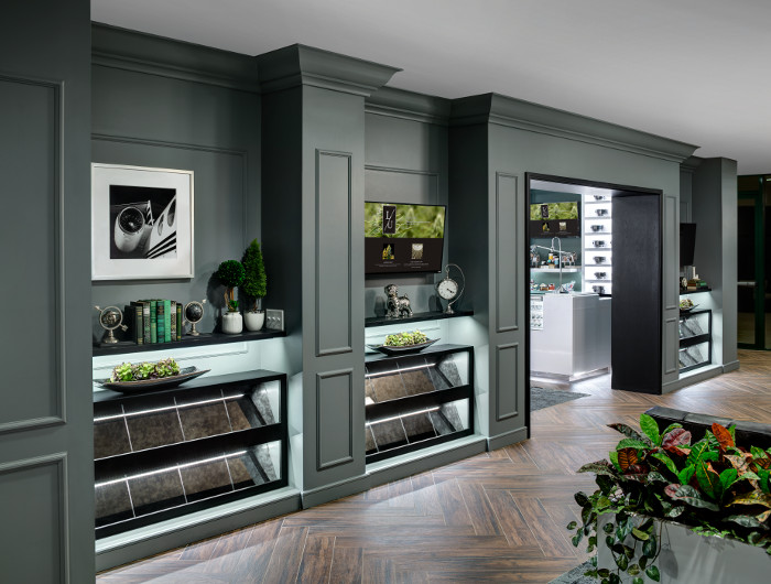
Level UP is a state-licensed medical marijuana dispensary with locations in prestigious Scottsdale, AZ and Tempe, AZ. The brand is committed to rising above the competition by focusing on providing patients best-in-class products and customer service. By designing an alluring environment of European-inspired sophistication with an upscale yet attainable quality, Level UP dispensaries are given the perfect setting to captivate any patient and secure their loyalty. Programming the space to cater to efficiency in both the patient experience and business operations was critical to maximize customer service and throughput. The Scottsdale location utilizes a regal green to create a very sophisticated, upscale setting. In Tempe, a black, white and bright blue palette suits the urban university setting and younger demographic. When you put them side by side they evoke the Level UP brand while speaking distinctly to two different markets.
Gnome Grown
Differentiating Brand Position – Organic Cultivation & Stewardship to Nature
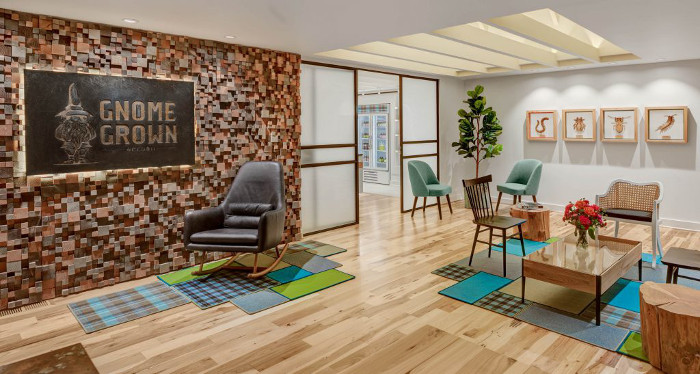
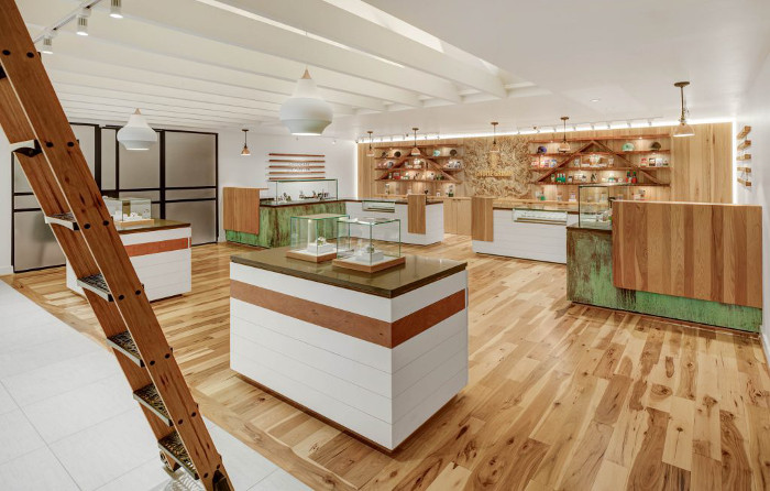
Gnome Grown Organics’ two retail cannabis locations in Oregon City, Oregon, are the embodiment of a brand dedicated to legendary organic cannabis cultivation practices, stewardship to nature, and a passion for quality. Every detail of the brand’s retail experience is inspired by the life story of one of their founders and carefully crafted to connect with each and every visitor in the most subtle and authentic manner. A palette of natural materials, contrasting textures, and cheerful colors come together to create a boutique shopping environment for viewing and purchasing Gnome Grown’s carefully curated selection of cannabis products. The use of powder coated mason jar lids for bud displays; reusable, recyclable packaging; and even a signature patterned fabric ties to the story and ethos of the brand.
Tru|Med
Differentiating Brand Position – Premium Concentrates & Modern Edge
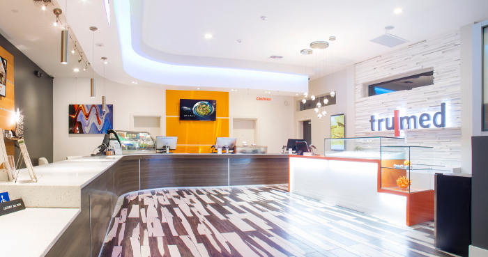
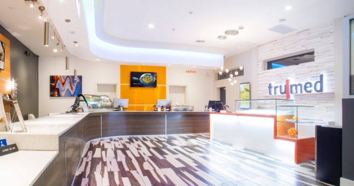
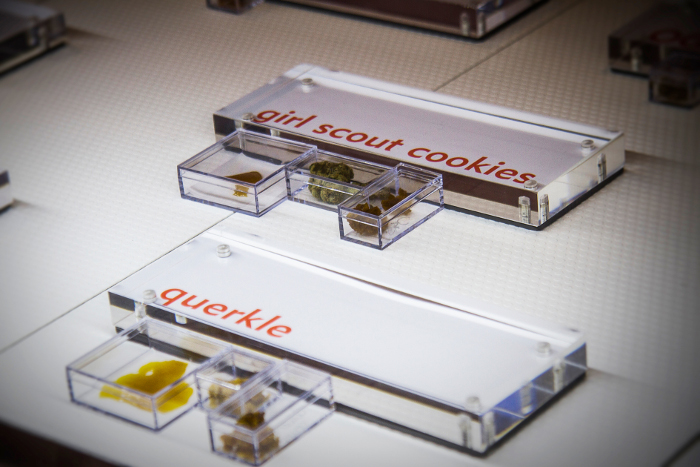
Tru|Med Dispensary in Phoenix, AZ has a reputation for quality that permeates their brand. As they looked to elevate their dispensary experience they were committed to launching an in-house line of premium concentrates. This project introduced the first-of-its-kind retail space dedicated to displaying and selling premium concentrates. The goal was to turn underutilized lounge space into a stunning, high-end experience that mirrored the exceptional quality of the products being sold. Using Tru|Med’s clean, modern, design aesthetic as a starting point, a jaw-dropping showcase and feature wall were created to make patients stop, ask, browse, and buy. Inspired by design trends of boutique bakeries and cupcake shops, the concentrate bar features LED-lit glass displays at counter-level. Every detail was carefully considered to exude the essence of the brand and elevate the product category.
As you can see from these examples, a solid brand breathes life into a dispensary. As we continue to walk you through the customer journey and explore key customer touch points in future columns, we will show you how a brand comes to life at every moment in the customer journey. Does your dispensary have a solid brand? If not, it is time to define it. Defining your brand is Step #1 in your journey as a dispensary owner. I promise, it will play a key role in your future success.
 A disruptor, innovator and entrepreneur, Megan Stone is the grand dame of dispensary design. As founder and owner of The High Road Design Studio, she has helped arm cannabis retailers with the power of design to combat stigma, overcome stereotypes, and reinvent people’s perceptions of cannabis and its users. Her unprecedented work has helped usher dispensaries onto Main Street and into the mainstream, and has forever changed the international conversation about the retailing of “vice.” Her work has been lauded for altering thoughts, feelings and behaviors worldwide, blazing a trail and earning awards and commendations for design excellence along the way. She is a frequent speaker and contributing editor in both the cannabis and retail design industries. In the fall of 2018, she will add “dispensary owner” to her growing list of credentials as she embarks on a partnership to open a cannabis boutique in Palm Desert, California.


