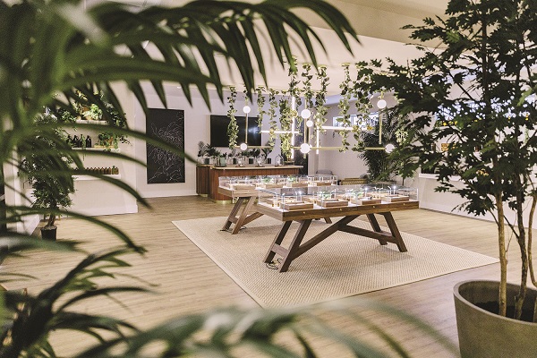
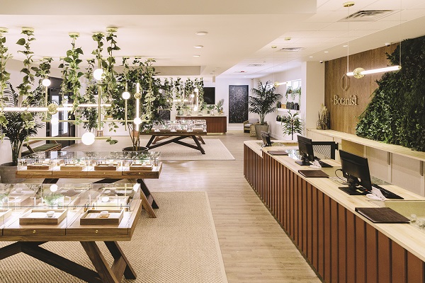
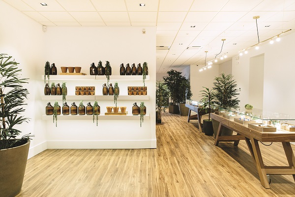
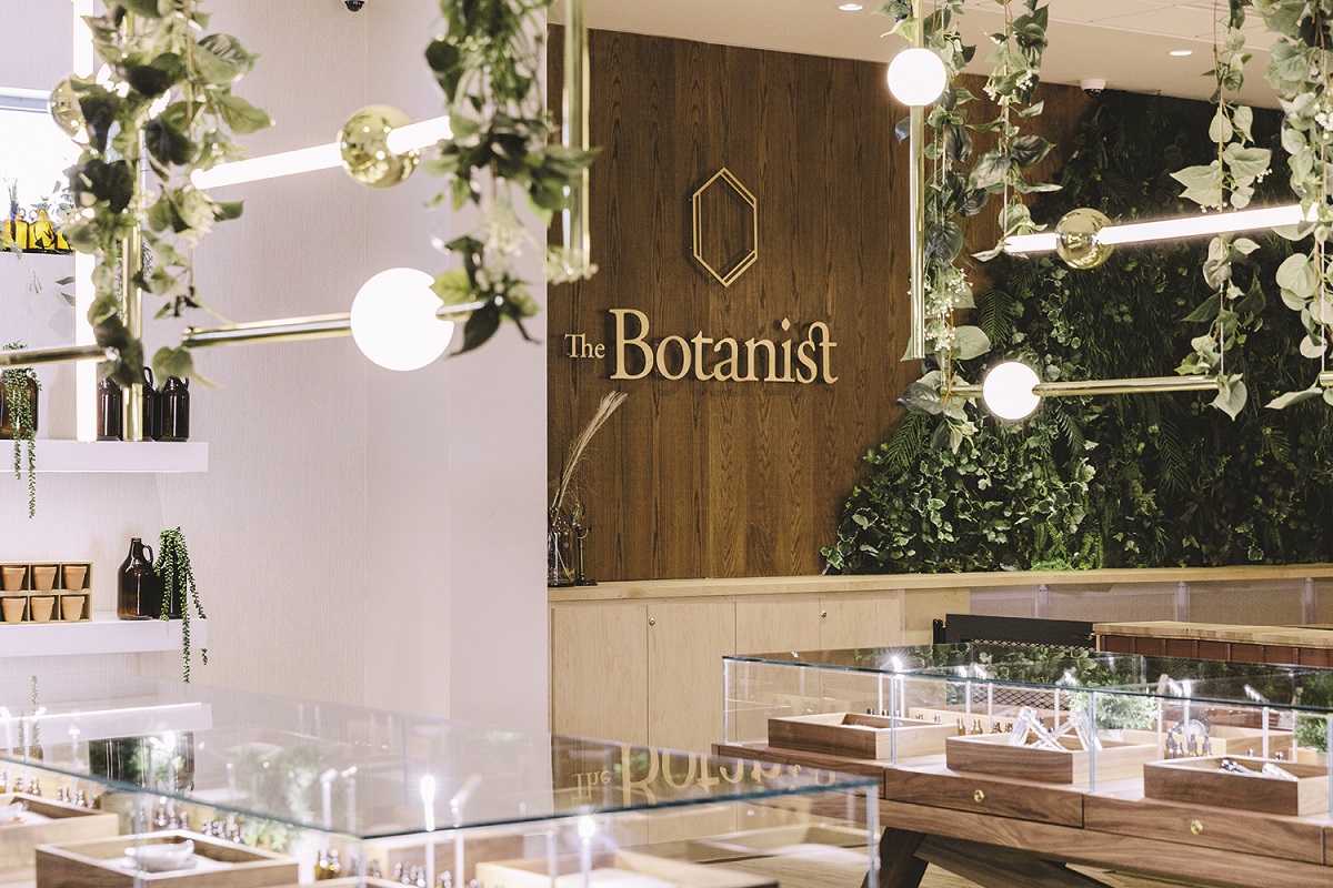
The Botanist is not what one imagines when hearing the term “dispensary.” The chain’s retail locations are bright, airy spaces awash in natural colors and living greenery, creating a sort of upscale-optical-shop-meets-plant-nursery vibe. Rustic wood, rattan, and terracotta add to the atmosphere, as do printed “field guides” that help patients navigate the world of cannabis.
“The Botanist’s design is essentially a sun-filled greenhouse,” said Creative Director Claire Coppins. She’s especially proud of the polished, golden tube lights suspended from the ceiling in a trellis-like pattern. Designed by Lee Broom, they connect and expand horizontally and vertically and can be arranged to alter form and function.
The genesis of the stores’ design emerged from a deep admiration of botany and those who were passionate about the intersection of science and nature. For inspiration, Coppins looked to parent company Acreage Holdings’ head of cultivation, renowned grower Phillip Hague. “Being able to tap into the mind of a real-life botanist allowed us to create an authentic brand—a brand that genuinely depicts the values, story, and craft of a botanist,” she said. “We discovered the true wonder and power of plants and cannabis, which we’ve woven into The Botanist’s branding and design.”

After refining the vision, Coppins hired mckinley burkart, an award-winning architecture firm based in Canada, to give the plan life. “When you have Mark Burkart, Walker McKinley, and Ursala Baig in a room, you know the result is going to be out of this world,” said Coppins. The design team and The Botanist’s management immediately began constructing an experience, not just a retail shop.
The first dispensary opened in Baltimore. The Botanist also now operates in Maryland, Michigan, New York, North Dakota, Massachusetts, and Florida. All share the same design elements that make the concept unique.
At the core of the chain’s rapid expansion is an immersive experience rooted in education and community. “The relationship between the consumer and cannabis is a journey of discovery,” Burkhart said. “The Botanist store design is meant to reflect this. It’s intended as a physical manifestation of curiosity, to evoke a strange taxonomy, a world of magical realism, a celebration of the uncanny. The design of the space reflects this universe, one in which nature has reclaimed its place.”
Shopping for cannabis, especially in newly legalized states, can be intimidating. Coppins and her team resolved to put consumers at ease from the moment they enter. “We want our customers and patients to feel relaxed and calm the moment they step into our world,” she said. The lobby is an inviting space devoid of waiting-room aesthetic or atmosphere, dressed in a warm color palette and enhanced with comfortable seating. As part of the company’s commitment to wellness, shops in the chain provide in-store education sessions and community events at the Seed Bar, a station decorated with industrial lights, bell jars, and a botanical wall where budtenders allow customers to get up-close and personal with products. Most stores offer events like cannabis 101, cooking with cannabis, and CBD-infused mocktail parties. “The Seed Bar was specifically designed to provide the local community with a safe space to learn about cannabis within The Botanist—a design I’m truly excited about sharing with our patients and consumers,” Coppins said.

“The Botanist is a place for both newcomers and seasoned consumers to meet like-minded people who believe in a healthy and balanced lifestyle,” said Coppins. “The design tries to encapsulate this. Every detail from our warm color palette to the natural materials and accents such as olives and terra-cotta decor was mindfully designed with our consumer in mind.”
The Botanist logo celebrates the intersection of science and nature and the healing power of cannabis. Every shop in the chain displays carefully curated greenery such as birds of paradise, fiddle leaf fig trees, kentia palms, and a range of succulents. The handmade, solid walnut flooring seamlessly compliments the verdure in achieving a tropical greenhouse flair. Every fixture and finish reinforces the design narrative. “The idea is to always bring everything back to nature, which is at the heart of everything we do at The Botanist,” said Coppins.
To create an even more authentic experience, Coppins and her team sprinkled lab tools and objects found in greenhouses here and there. The sales counter is dressed in terra-cotta tiles topped with a solid walnut plank, suggesting a potting bench. “We designed each fixture to incorporate plant life, most notably the walls behind the point of sale, the trays in the merchandise tables, and the terra-cotta shelf fixtures, all of which reinforce the rich greenhouse ethos,” said Coppins.

The company’s merchandising strategy carefully avoids overwhelming patients by adopting a minimalistic approach with elegant glass-and-wood display tables and simple wall shelving to hold products, educational information, and pamphlets. According to Coppins, the design encourages patients to explore the space and discover products organically.
Brands stocked must balance quality and price. “We not only want our products to be affordable, but also to be effective medicine to help those during their time of need,” said Sharon Ali, general manager for the Baltimore shop. “I believe we have found a healthy balance, but it will always be evolving based on market and patient needs.”


[…] The Botanist | Connecticut, Massachusetts, New Jersey, New York, Ohio | March 2020 […]