To say time was of the essence in building out The Hunny Pot’s inspired design would be an understatement. The shop’s owners had only eight weeks to complete their splashy flagship—Toronto’s first legal store. Luckily, they were able to quickly find an ideal spot in the heart of downtown, on tony Queen Street West, home to chic art galleries, smoky music venues, vintage clothing boutiques, and the swankiest bars in town.
Amazingly, the 3,500-square-foot space offered the precise structural bones required: multiple levels, soaring ceilings, and a neutral color palette, all surrounding an open central staircase that rises toward an asymmetrical skylight. The hive-like space needed only to be filled with retail fixtures, touched up, and pollinated with top-shelf cannabis brands, flower motifs, and iPad-carrying budtenders.
“The location was specifically chosen because they wanted it to be a destination point,” said Core Architects partner Gabriela Estrada, who worked on the shop’s design. “Knowing the goal was to open as a historic benchmark for Toronto in the emerging cannabis retail industry, it made perfect sense.”
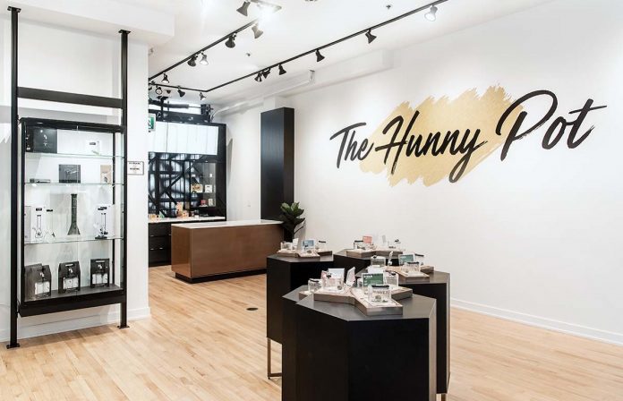
From the outset, The Hunny Pot execs were open to creative and problem-solving input. Many challenges had to be overcome—and quickly. The brand’s name proved most challenging. Befitting a modern, multilevel structure resembling a beehive, someone suggested a nod to owner Hunny Gawri’s name. Everything quickly began falling into place after that. To evoke a honeycomb, designers employed golden-hues, hexagon shapes, and bee patterns, both literal and abstract. For instance, hexagon display tables sit on metal legs. When arranged in a cluster, the tables create a hexagon pattern on the floor. “This is subtle,” said Estrada, “but it carries the design effect further.”
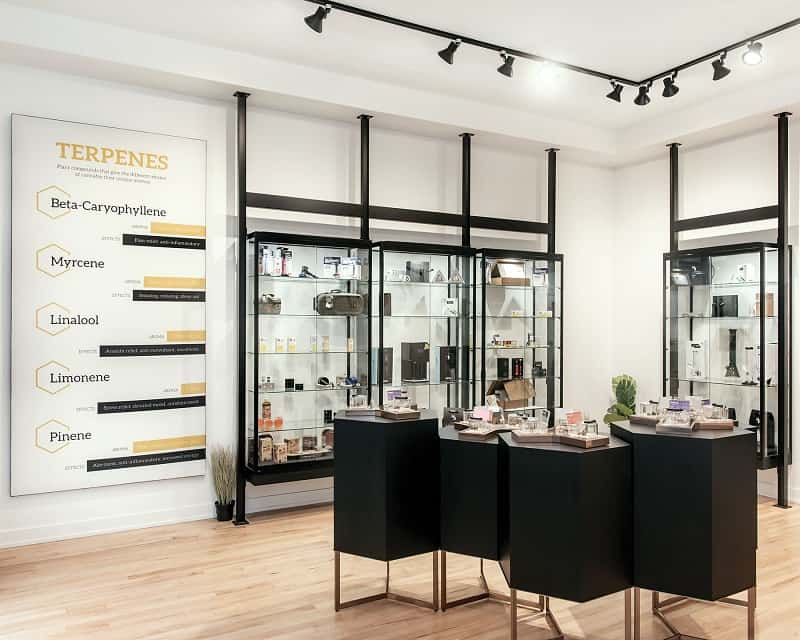
With a gold logo on the lobby’s moss-covered wall, a gold metal reception and cash desk, a gold honey “drip wall” and gold metal legs on the hexagonal display tables, the idea was not to be fine-spun but to inject an upscale effect into the cannabis retail experience. To balance this, they added splashes of urban modernism with specially designed open display cases flecked with black linear metal accents.
“Our goal for this flagship store was to introduce our branding as seamlessly and effortlessly as possible,” said Gawri. “The honeycomb, the foundation of our brand, can be seen through many aspects of the space. Our bud bars and display jars mimic the honeycomb throughout their design from top to bottom. Our screens behind reception showcase small honeycomb visuals. These small details do not go unnoticed; in fact, we have many customers compliment the details and design of the store daily.”
Architects and designers envisioned the open central atrium and skylight as the focus of the space. “The stairwell and large skylight already existed in the space, and we wanted to further enhance their presence by keeping the area free and clear of fixtures cluttered around so it would be one of the highlights of the store,” said Lili Vu, a senior associate at Core Architects.
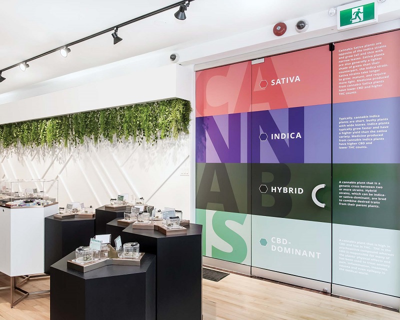
Creating a “wow experience” as customers enter the shop represented a significant challenge. Ontario’s regulations prohibit visibility of cannabis and accessories from outside the premises, and customers’ IDs and age must be verified prior to entry. Core turned the dilemma into a creative opportunity by adding visual texture in the form of eleven-foot-high perforated black metal screens that create honeycomb shapes when viewed at particular angles. “This is another element that ties into the ‘Hunny’ theme,” said Vu.
We constructed a valance with green vines cascading over a large, moss-green wall to optimize and showcase the store logo for potential marketing ‘selfies’ to further push the social media platform and brand while customers waited in line to enter.
—Gabriela Estrada, partner, Core Architects
Designers intended the screens create a divider between the greeting area and the rest of the store, and they’re satisfied with the result. The perforated dividers do not make the space feel completely blocked off or unwelcoming as a solid wall might, but instead provoke consumer curiosity about what lies beyond.
According to Gawri, “Our lobby is the first impression for our customers, and we wanted it to be full of energy and warmth.” An opulent honey-hued metal reception desk and cash desks scattered throughout the space also bear perforated panels, echoing the dividers in the lobby. “The overall intent was to create an unexpected but welcoming customer experience, hopefully diminishing any concerns regarding the sometimes-negative stigma associated with cannabis,” said Estrada.
“To warm up the space, we worked with another layer and texture by using greenery,” she added. “We constructed a valance with green vines cascading over a large, moss-green wall to optimize and showcase the store logo for potential marketing ‘selfies’ to further push the social media platform and brand while customers waited in line to enter.”
Each level houses a specific shopping zone. “The idea was for the customer to feel comfortable while browsing the products through the space,” Vu said. “It’s intended to be warm and inviting and to help change the stigma surrounding cannabis culture. This was achieved through open airiness of the fixture placement and the warm tones of the wood flooring and greenery.”
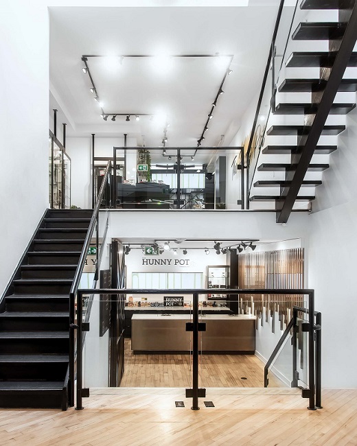
Because the shop is large, the Core team simplified customer flow. In service of efficiency, they designated different areas for different purposes. The main floor contains the lobby and a cash desk devoted to quick purchases. The top floor houses the main bud bar, and the middle floor comprises a combination of the two with a small bud bar and secondary cash desk area.
Bud bar fixtures are made of rift-cut white oak, painted white and black. Some incorporate glass showcases to highlight key products. The shelving was designed to be modular and interchangeable for easy display modification, like featuring new products or rearranging existing lines into different clusters.
On all levels, lighting plays a significant role. “The lighting is crucial to how the store and products appear,” said Estrada. “The client wanted a brightly lit store to make the shopping experience inviting.” To accomplish that goal, the architects specified black track lighting, which augments the modern aesthetic and reflects the colors of perimeter floor fixtures and the diagonal lines on the black metal screens. The team also placed LED strips at strategic locations to create ambient lighting and highlight design elements like the vertical metal slat wall, the moss wall, and valances of hanging green vines. Although it’s not a dominant feature, Vu said the greenery not only adds color to the space’s otherwise neutral palette, but also telegraphs a relaxed, friendly vibe. “It is also a nice contrast to the hard edges of the geometric shapes and patterns in the rest of the space,” she said.
In the end, “The Hunny Pot was finished on time largely due to the positive attitude of the whole team and the miracle of everyone working together towards a historic moment in this industry,” said Vu. “Our main collaborators were Seven Point Interiors, who pushed through the final leg of the design execution with the fixture fabrication in a very expedited timeline to help complete the vision.”
The Hunny Pot | 202 Queen Street West, Toronto, Ontario M5V 1Z2


