Food—what a glorious thing. It nourishes us, sustains us, draws us together, and provides us with comfort and fulfillment. When infused with cannabis, food takes on a whole new level of pleasure, both medically and recreationally. The variety and quality of cannabis-infused food products has grown exponentially over the past two years and now is one of the most exciting areas of innovation and creative focus in the industry.
Although edibles aren’t for every patient and customer, they are an essential product offering in our dispensaries. Here are a few simple tips for making your edibles displays look like #foodporn and increasing sales within your current product offerings.
Go naked
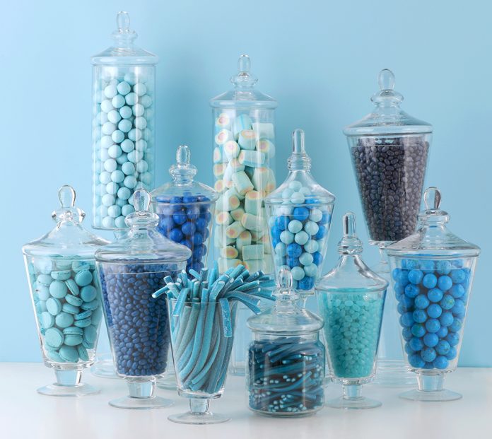
Display products in their natural context and remove packaging whenever possible. Try a platter, a cake stand, or a pretty bowl to show items in a familiar and enticing manner. Tiered food displays offer more surface area to work with and are more appealing to shop. Stands come in a variety of materials. Coordinate with your style and branding: clear glass, plastic, or metal. They bring an element of normalcy and discretion to the products—real food vs. “pot brownies.”
Some new products are practically packaged in artwork—Leafs by Snoop Dogg and Craft Elixirs, for example. The brand power of companies like this should not be edited out of your displays. Instead, integrate them gracefully and tactfully. One box of Dogg Treats Lemon Drops placed next to a glass bowl filled with the cellophane-wrapped lemon candies will make mouths water and convince patients to buy more than one box.
Big is beautiful.
Create an abundant look. Abundance sends a message of fresh. Regardless whether the setting is a specialty food boutique, farmer’s market, neighborhood supermarket, or dispensary, food displays better as a feast than a famine. A sparse selection feels picked over and stale. Shoppers aren’t enticed by sparse. Give your customers the kid-in-the-candy-shop feel.
Create the illusion of overflowing bowls of candy by in-filling the containers with tissue paper, cotton, etc. Displays needn’t be stocked with expensive medicated treats. Ask your edibles vendors to supply non-medicated product for display. My clients have found edibles makers typically are happy to work with them on this. When you sell more, they sell more.
Say it loud; say it clear.
A well-informed shopper is a confident shopper. Confident shoppers convert to buyers at a higher rate. Signage and product information that conveys information (i.e. flavors, ingredients, dosages, strength) should be available at the products’ display. To create signs that are useful to your shoppers, ask them what they want and need to know. Knowing your customers’ needs and desires will provide the specific information necessary and may spark a conversation—leading to a sale and a happy customer.
Segregate the “-frees”: gluten-free, dairy-free, sugar-free, and cholesterol-free. “Free of” product always should be labeled as such to differentiate it from the masses. Signage also should highlight products that are new, exclusive, or in limited supply.
Remember: Your store’s signage always conforms to your brand guidelines and visual identity—same colors, fonts, and style. Your signage should be the main source of information; don’t rely on product packaging. This way, your displays look clean and organized. When it comes to selling a product like food, this is a must. After you have followed my advice above, your displays will look more like the bakery case at Sprinkles Cupcakes and less like a 7-11. Don’t take steps backwards by putting up unflattering signs.

Be clever with color.
My mother used to make sure our dinner had color. Food tastes better when it looks better. Think about the colors of your products, and decide what colors might complement them. Color theory tells us that yellows and reds stimulate appetite. Perhaps a red plate for the BAKEDlava will whet appetites and lead shoppers to buy an extra little treat before checking out.
Clean enough to eat off of.
Keep it clean. This is food we’re selling. It must appeal to our visual senses as well as common sense. If the dispensary looks dirty, we stop looking. If the shop and products looks pristine and fresh…bring it on!
Likely your displays are beautifully lit. Make sure glass clear and sparkling. Keep surfaces free of dust, fingerprints, and glass streaks, or that’s what your shoppers will focus on first. Go a step beyond the usual (dust-free tables, displays, counters, and signage) to keep the actual products clean and pristine, as well. Make a show of keeping things spotless by cleaning while the store is open, not just when it’s empty. Active cleaning sends a strong message that you run a tight ship and you care about your shoppers’ experience.

Megan Stone is founder and owner of The High Road Design Studio. A disruptor, innovator and entrepreneur, she has helped arm cannabis retailers with the power of design to combat stigma, overcome stereotypes, and reinvent people’s perceptions of cannabis and its users. Her award winning work has helped usher dispensaries onto Main Street and into the mainstream, and has forever changed the international conversation about the retailing of “vice.”


