Product packaging is a delicate blend of art, science, and technology. Not only must the container protect consumer goods during storage, shipping, and distribution, but most companies also use their packaging as a sales tool, marketing medium, and brand identifier. Sometimes, as is the case with cosmetics, packaging must function as a product applicator long after the sale. In highly regulated industries like cannabis, product packaging also must serve government-mandated purposes like consumer protection.
For all its functions and potential commercial value, packaging receives little respect. It’s often an afterthought during the development cycle and, as such, receives the least time, thought, and budget.
Advertisement
That is a mistake.
Consider this: In a global survey, Nielsen discovered 52 percent of consumers base at least part of their purchasing decisions on a product’s package. Forty percent of consumers say they share packaging they find attractive or interesting on social media. Ninety percent of consumers reuse product packaging for another purpose (think shopping bags and cigar boxes), making brand messages outlive the products themselves by years, in some cases.
Need another reason to pay attention to the box? In one study, 30 percent of businesses reported significant sales increases after a packaging refresh, even though the products inside hadn’t changed.
Regardless how good a product, it’s going nowhere without good packaging. Though what constitutes “good” product attire is extremely subjective, perusing eye-catching, purposeful designs can be both educational and inspirational.
Take a look.
Advanced Nutrients uses larger-than-life characters and bold colors not only to bring a little fun into customers’ lives, but also to increase product memorability. The characters, designed by Mark Burckhardt and brought to life by Pentagram, resonate with consumers: Users may not remember a product’s name, but they remember Advanced Nutrients and the illustration on the package.
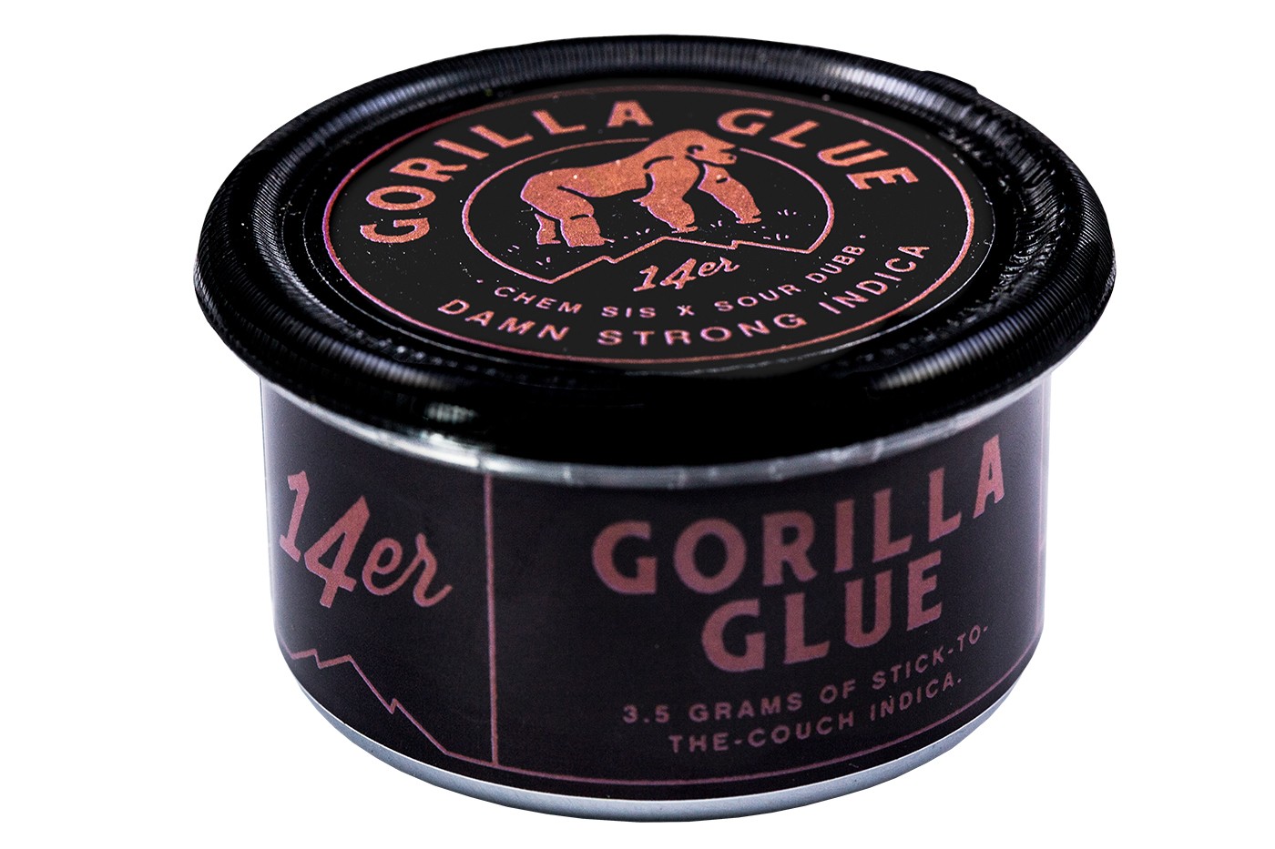
14er turned to N2 Packaging for a solution that would extend flower’s shelf life in order to provide consumers with always-fresh products at affordable prices. N2’s patented, hermetic-sealing process also accomplished child-resistance and labeling compliance as well as easy strain identification. The result is bold with a subtle touch of humor.
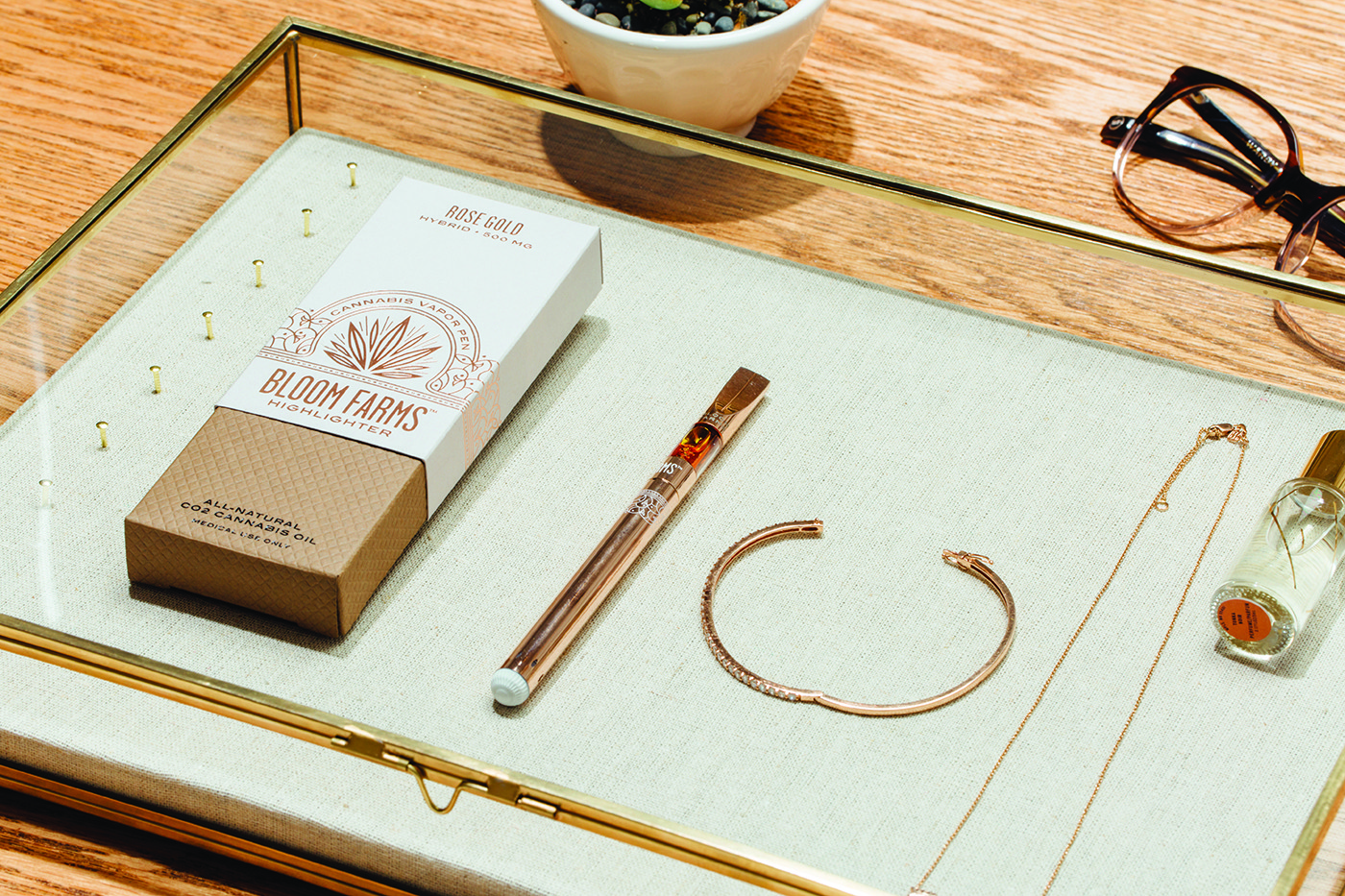
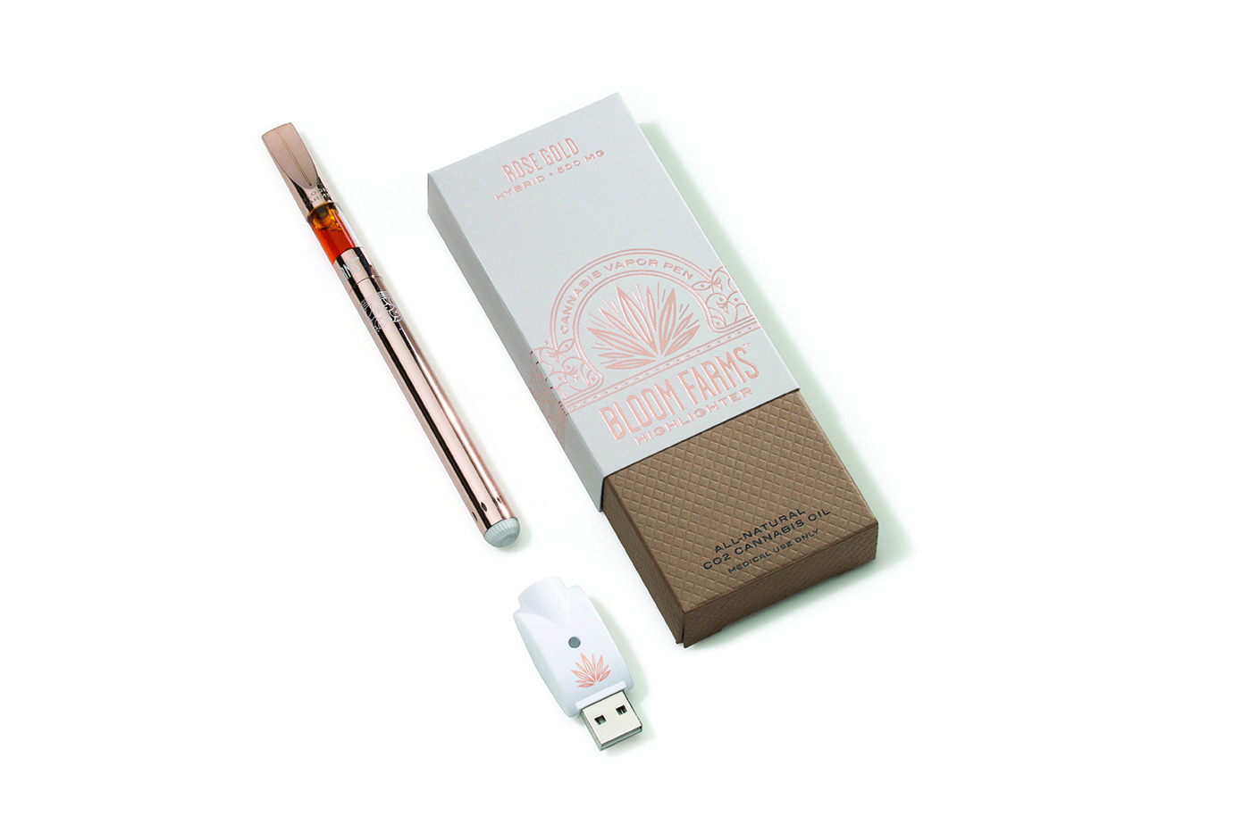
Bloom Farms founder and Chief Executive Officer Michael Ray designed the company’s packaging. He said he’s especially pleased with the Highligher line. “It helps achieve our mission of changing the conversation about cannabis,” he said. “Packaging is the consumer’s first impression—their first touchpoint.”The eloquent graphics “do an excellent job of providing a non-intimidating experience.”
Canndescent‘s packaging demystifies cannabis flower, according to Senior Brand Designer Ashley Parker. Because strains are named and color-coded according to effect, choosing a product to create an experience is quick and easy. A minimalist graphic design in the company’s signature orange color, inspired by the cannabis flower, evokes luxury and vitality.
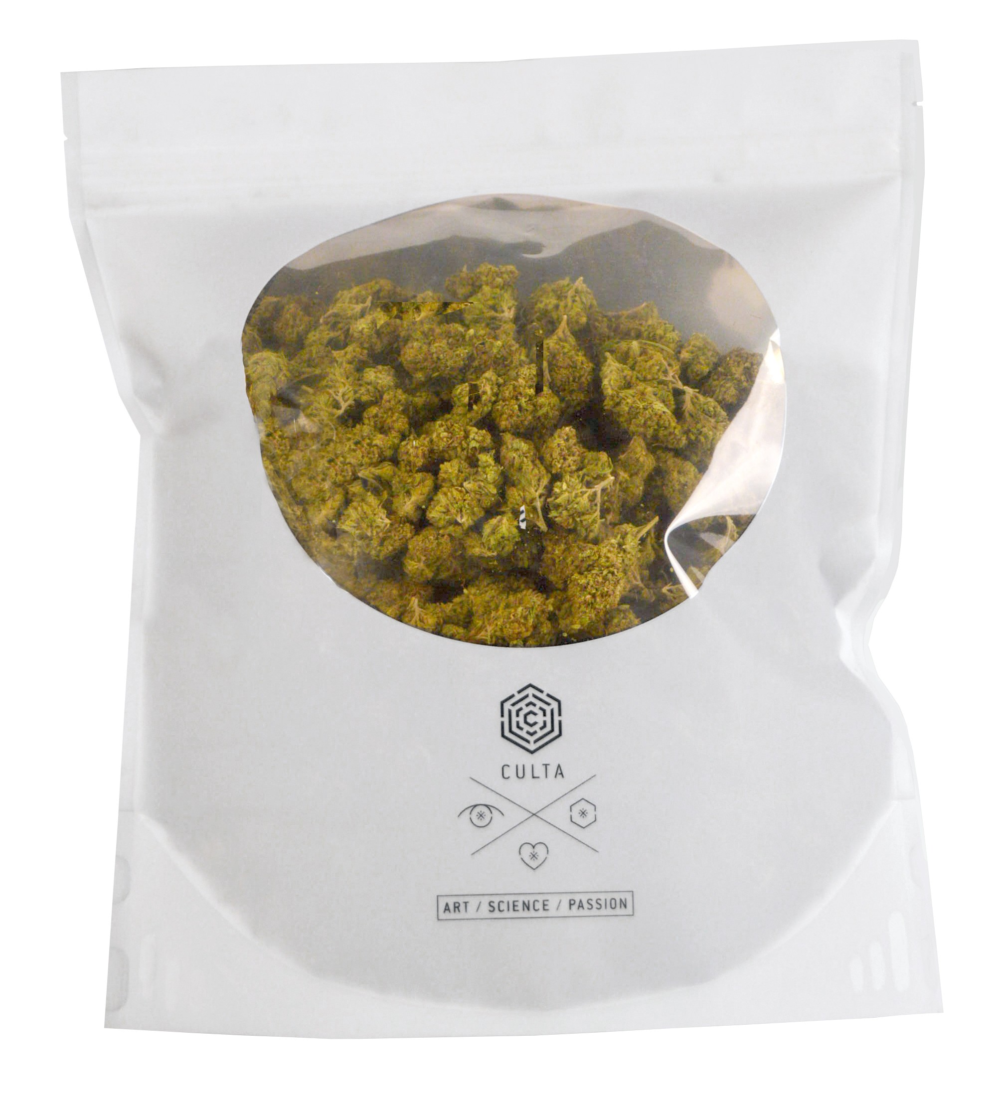
Culta needed a package that prevented aroma from escaping and maintained the quality and freshness of flower during transportation. Cannaline’s proprietary film was developed specifically for cannabis storage and proved a perfect fit for Culta’s desire to keep overhead costs low. The window on the front allows consumers to see the product before purchase.
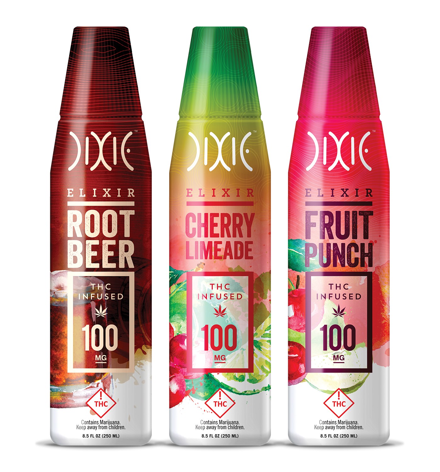
According to Dixie Brands Art Director J. Hartett, “Like much of Dixie’s packaging, our elixir bottle designs are centered around hyper-saturated colors with stacked bold and confident typography. Those choices are designed to convey there is nothing subtle going on inside or outside the bottle. The appearance, flavors, and efficacy are all enthusiastically strong.”
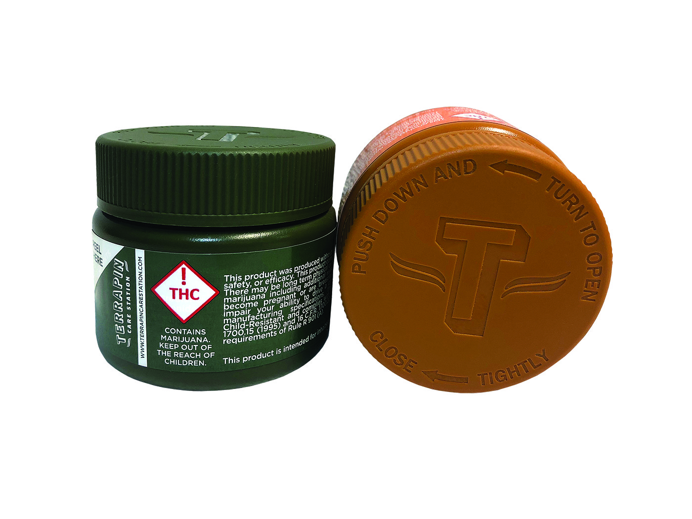
Terrapin Care Station is committed to environmental sustainability throughout the production process. Drug Plastics’ sleek, modern jars, in four colors, are composed of polyethylene resin produced from sugarcane ethanol. The recyclable plastic reduces the manufacturer’s carbon footprint while providing a scalable solution for Terrapin’s flower and concentrates.
Healing Harbors wanted to elevate the graphic appeal and oil-resistance of its tincture and body butter labels to better reflect the nature of the products and prevent deterioration during product use. The Kind Creative’s satin-finish design with photographic elements meets the objectives and pays homage to Healing Harbor’s Maine roots.
Moxie needed a unique, patentable, brandable package to showcase vape cartridges while meeting or surpassing regulatory standards for child-resistance. Packed LLC met the challenge by engineering an injection-molded plastic shell with an ethyl vinyl acetate foam fitment that incorporates both visual and tactile components.
The High Expedition wanted packaging that conveyed its sustainable, Earth-friendly ethos. Hemp Press designed a custom hemp-paper box, allowing High Expedition to display its pet supplements in a container composed of the same regenerative plant material from which the products are made.
The Tribe Collection is a conceptual brand and product line of accessories and flowers. The Kind Creative team intentionally designed the packaging—including vape pens and cartridges, tins, jars, and bags—to be bold and masculine, using contrasting effects and custom dielines for a luxurious, high-end package. Paper stock is of matte finish with gold foiling and a suede interior for a tactile object on the shelf.
Utopia Cannabis tapped Hippo Packaging to create a regulatory-compliant, interactive consumer experience from the outside in. The boxes are sturdy enough to protect the flower and concentrates inside without compromising the elegant, sophisticated brand image Utopia wanted to convey. Consumers are drawn inside bythe intriguingdesigns printed oninterior surfaces.