


While every aspect of the cannabis industry has undergone major changes in the past five years, none have been more radical than those in retail packaging. Although some brands dedicated significant resources to their products’ shelf presence from the beginning, many others just now are beginning to realize the importance of presenting a solid brand identity in stores and consumers’ hands. The resulting change in the landscape is nothing short of extraordinary.
Among the most noticeable shifts has been movement away from shades of green, marijuana leaf iconography, and Rastafarian motifs. Bloom Farms was in the vanguard, presenting its boxed pre-rolls in classic foil with gently debossed type for a subtle touch of elegance. “Bloom Farms was one of the first brands to understand that in order for the industry as a whole to be legitimatized and taken seriously, outdated stereotypes needed to be shed in order to attract new and casual-use consumers,” said Michael Hester, founding principal and creative director for Pavement, a San Francisco-based design and packaging studio.
Other brands took notice. Companies began playing with size, shape, tactile experience, colors, and materials found in high-end mainstream retail packaging. Today, brands are spending big to hire heralded packaging and design firms and world-class consultants. They source materials from vintage tin companies and lavish paper mills. “As the cannabis and CBD markets have grown, Neenah has seen the demand for premium packaging evolve as well,” said Michelle Turner, brand manager for Wisconsin- and Georgia-based Neenah, a 100-year-old leader in the creation and manufacturing of papers for premium packaging and label applications. “Cannabis products are quickly becoming more mainstream, and experience shows high-end, luxury brands want to showcase their products with high-end packaging.”
Another major change? Chic yet sustainable packaging is en vogue—and in demand. “The increasing focus on sustainable packaging is great to see,” said Jesse Dixon, director of strategic sales at package engineering and manufacturing company GPA Global. “The seemingly collective goal to move packaging to be as earth-friendly as the product seems to be received well by consumers and industry professionals alike.” James Eichner, who co-founded Sana Packaging, said satisfying the demand for renewable and regenerative materials can be challenging. “Our core focus has always been on circular and sustainable cannabis packaging solutions, and we’ve seen a huge increase in demand lately,” he said. “It’s gotten to the point where we’re generating fifty-plus leads per week.” Sana develops containers not only from hemp and other plant fibers, but also from reclaimed ocean plastic.
Neenah’s Turner said her company keeps 30-percent to 100-percent post-consumer-waste options in stock to meet the demand from cannabis customers. The company also developed the first bright-white premium hemp fiber folding carton papers.
Other innovations like Hush-Kush’s Perma-B, a process consisting of coating the inner surface of pouches with a completely biodegradable beeswax-based natural compound, are gaining popularity too. Simple, efficient, smell-resistant, waterproof, size-customizable, and lightweight, the Hush-Kush pouch is the only product using the technology. “My partner and I have seen companies using a similar technology in the food industry,” said Hush-Kush co-founder Héloïse Fortier. “Learning about all the other great properties of beeswax, we had the idea to create a pouch for environmentally conscious cannabis brands who were looking for a fun, practical, and affordable carrying accessory that is customizable, able to carry five pre-rolls, and fits perfectly in a jeans pocket.”
That cannabis packaging has taken on mature sophistication is no small feat considering the obstacles and stumbling blocks that stand in the way. Regulations vary by state and are subject to spur-of-the-moment revision in some jurisdictions. Among them are rules about font and iconography sizes and colors, warnings, and required “out-front” information. The challenges can be frustrating, but they also create an environment ripe for creativity. “We’re starting to see some more thoughtful packaging,” said Courtney Zalewski, founder of creative agency Studio Good. “More and more brands are going the extra mile with details and printing techniques.”
Freelance retail packaging creative Gordana Perić indicated the industry’s metamorphosis is far from complete. “I am impressed with the progress and how quickly it got to the point of having so many beautifully packaged products,” she said. “At this pace, I have no doubt we will be seeing even more impressive packaging in the near future with more illustrative and typographic designs.”
Here are 20 packaging designs we found noteworthy this year.
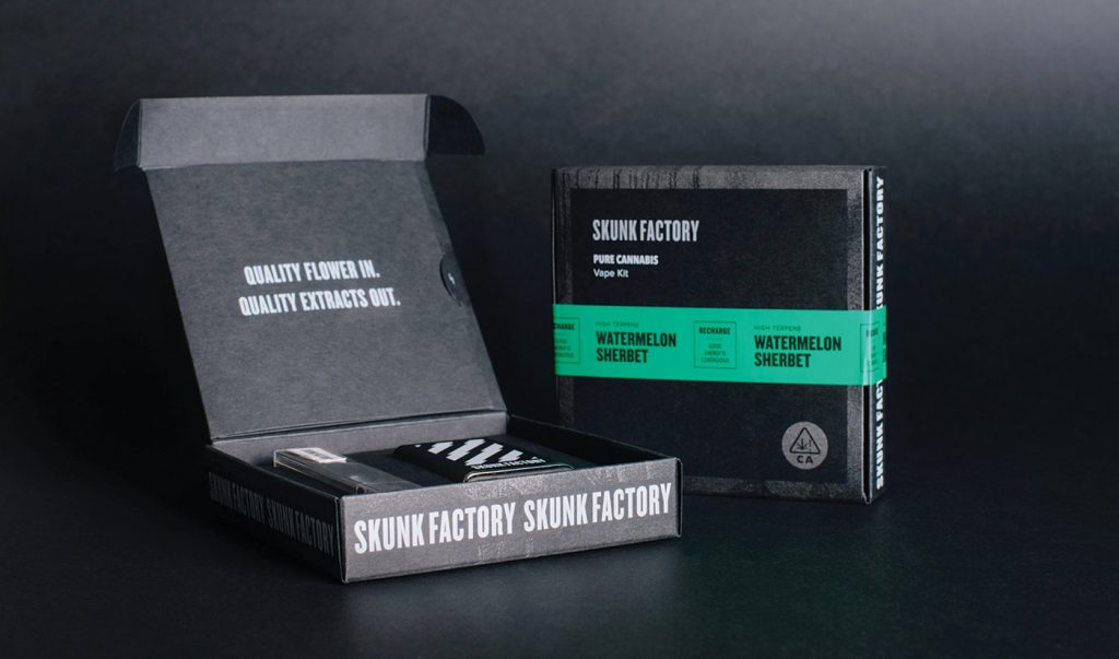
Skunk Factory
Creative agency Noise 13 built a package system that showcases Skunk Factory’s street-savvy and unapologetic attitude. The base packaging employs sleek, uncoated black paper stock with white and metallic-silver ink. By spending extra money on colored paper, Noise 13’s design team cut down the number of ink colors and ensured solid black on all folded corners.
“For the flavor indicator, we were inspired by the street and yellow caution tape,” said Dava Guthmiller, founder and chief creative director at San Francisco-based Noise 13. “By repeating stripes and text—mimicking street signs and streetwear fashions—and incorporating pops of bright color with a glossy sticker, we were able to punch up the look and feel of the brand.”
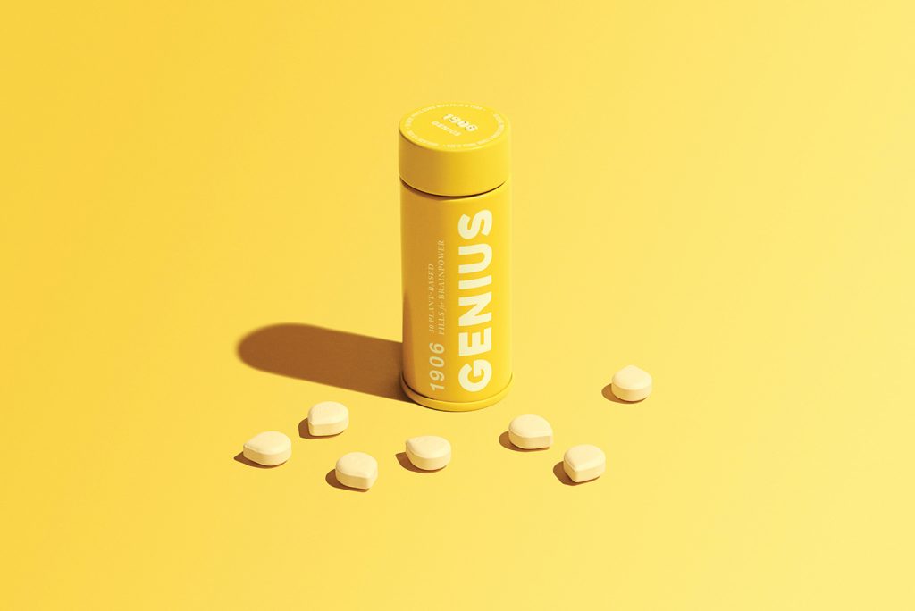
1906
1906 is named for the year the Pure Food and Drug Act passed, kicking off what would become the era of cannabis prohibition. To capture the brand’s lively, punchy spirit, 1906 hired Studio Good to remodel its original packaging. The creative agency saturated handsome boxes and tins with Skittles-like colors—canary yellow, rosy pink, lagoon teal, lavender purple, tangerine orange—to enhance the playful side of the brand’s image.
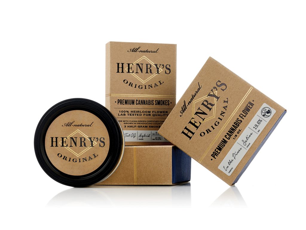
Henry’s Original
Henry’s founders take pride in being real farmers—the kind who can spot what a plant needs from 100 feet away. The Henry’s team applied the same attention to detail in its efforts to create packaging that reflects an utter lack of pretention. Containers evoke comparisons to vintage apothecary labels—fitting for a company that offers heirloom craft cannabis. “The custom box is made with natural papers flecked with fine gold foil details that forge an understated sophistication,” said Pavement’s Hester, who created Henry’s shelf look.
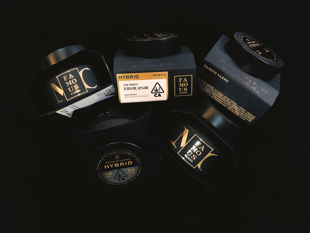
Famous Farms
Born and raised in Hollywood, California, Famous Farms’ packaging would feel right at home on the beauty counter at Nordstrom’s or Barney’s. When, at age 10, the brand’s identity needed a refresh, the company called on Studio Good. The mod and bespoke matte black paper wrap with raised gold foil and die-cut lettering evokes both modernism and stardust nostalgia. The jar’s lid, which could pass as a ritzy eye serum jar the size of a petite hockey puck, sits perched atop the center of an open-sided box. The voguish gold stacked logo framed in a square is straight out of a Tom Ford design and screams extravagance and opulence.
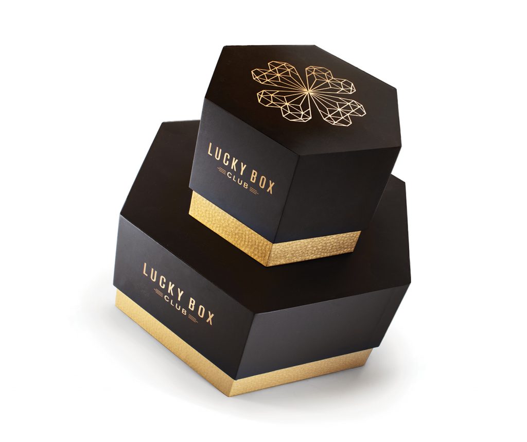
Lucky Box Club
Lucky Box Club is a CBD subscription service providing monthly boxes of high-end, “mystery” products to members in California. With an existing brand identity in place, Lucky Box Club hired San Francisco’s Pavement branding and design studio to create a container as discreet as it is premium. Luxurious paper and gold foil complement the hexagon hat box style structure to create a delivery experience that feels fanciful and covetable—brand values key to LBC’s business model.
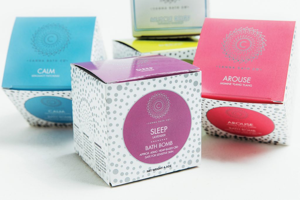
Canna Bath
Canna Bath’s original packaging proved too pedestrian to serve the goal of appearing on shelves in high-end stores. So, the company turned to Hippo Premium Packaging to redesign its entire look. Now, petite, eye-catching boxes and glossy bags pop with softly fluorescent greens, yellows, blues, and purples. According to Hippo founder Kary Radestock, re-packaging resulted in the brand landing shelf space in leading retailers. “Within a short time, Canna Bath’s sales doubled,” she said.
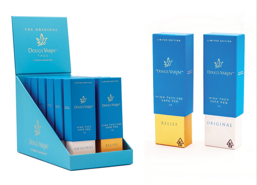
Doug’s Varin
Doug’s Varin is a unique product—the first-ever THCV vape pen—and the packaging had to reflect that. The ocean-blue, telescoping rigid box with a hot-gloss soft gold foil, in combination with a display system outfitted in cooling azure blue with a soft matte gold foil liner, is at once elegant, distinctive, and dashing.
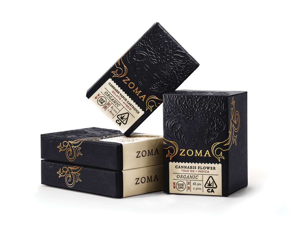
Zoma
Zoma radiates luxury with a dark, mysterious edge—perhaps not surprising, since the brand’s owner is a professional magician. Sacred geometries and other arcana play into the packaging’s look. Pavement created layers of contrasting textures with embossed elements, gold foil, Classic Crest Epic Black paper from Neenah, and whimsical perforations conjuring turn-of-the-century vintage stamps. An overall sense of balance, sophistication, and enigma give the packaging a bewitching and fetching feel. “We used a blind emboss illustration of Mother Earth paired with gold foil flourishes so it feels opulent and indulgent, yet grounded and calming,” said Hester.
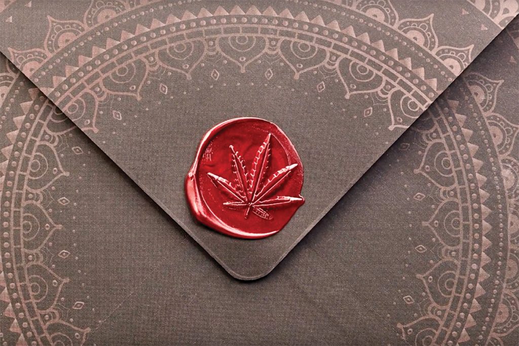
Golden State Greens
Golden State Greens, an upscale dispensary in San Diego, wanted statement boxes to contain its most exclusive flower and pre-rolls. Hippo Premium Packaging met the challenge with a charming mandala-inspired, soft touch box with a magnetic closure. The design employs matte copper foil and spot UV coating with an authentic red-leaf wax seal to add a touch of old-world panache.
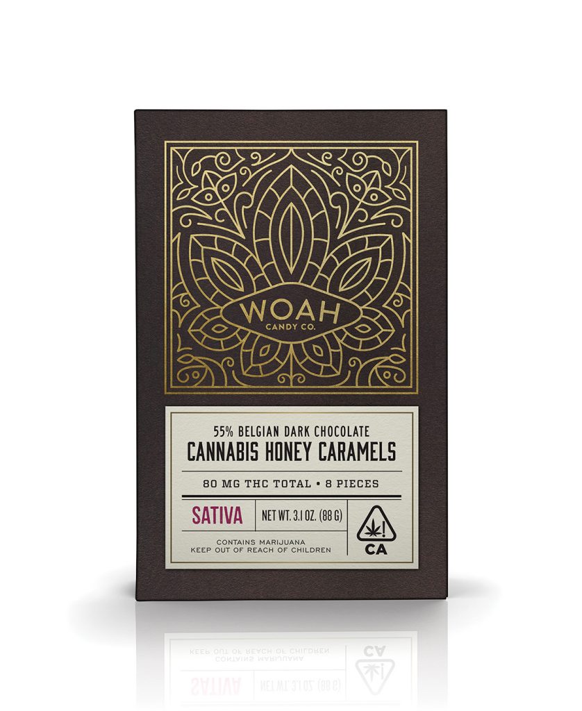
Woah Candy Co.
Woah’s founders wanted the company’s packaging to tell the story of a family of artisan confectioners. “The design harkens back to vintage confectionery packaging with an intricate and playful gold-foiled logo as the centerpiece,” said Pavement’s Hester, who headed up the project. The resulting look feels worldly, elevating the brand above the crowded edibles marketplace.
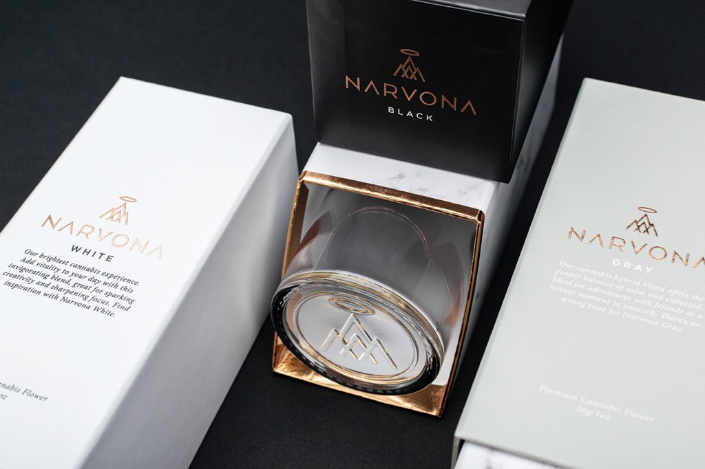
Narvona
Narvona aspires to be both luxurious and approachable. Wick & Mortar began with a minimalist style incorporating marble, custom glass jars, and thick, matte packaging with debossed metallic foil printing. The containers combine visual and tactile appeal. “Opening any container of flower is a unique experience, but we opted to create glass jars with a snow globe effect, so rather than seeing the lid you instead see their impeccable flower first,” said Wick & Mortar founder and Chief Executive Officer Jared Mirsky.
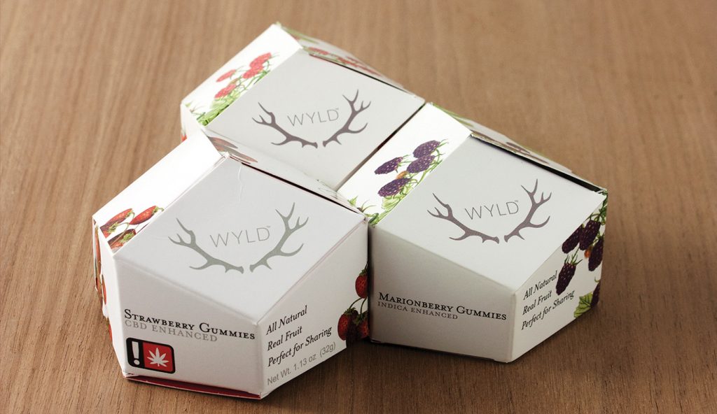
WYLD
WYLD’s gem-shaped containers are fresh and free-spirited, seemingly imbued with the wildness and nonconformity the company holds at the heart of its brand. The packages’ contours conjure the impression of a rare mineral or wild berry, and the logo works seamlessly with the design—a keen juxtaposition of soft organic images combined with rigid geometric edges. “The origami box is fun and inviting. It’s a little like opening up a present,” said Vice President of Business Development Tyler Elson. “The experience of the packaging and effects are something we want people to always think about and come back to.”
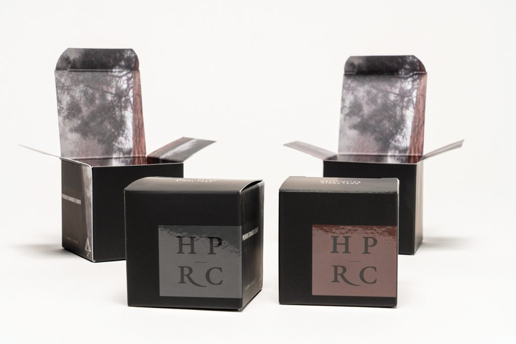
Humboldt Patient Resource Center
HPRC already had a beautiful design concept and logo for its award-winning product line but needed updated packaging. “We showed how the addition of soft-touch lamination and spot UV coating would showcase the quality of their brand and bring out the best in their design,” said Hippo’s Radestock. The earth tones and tangled tree branches that appear on the roof of the box when opened illustrate Hippo’s signature “interior-exterior” design approach.
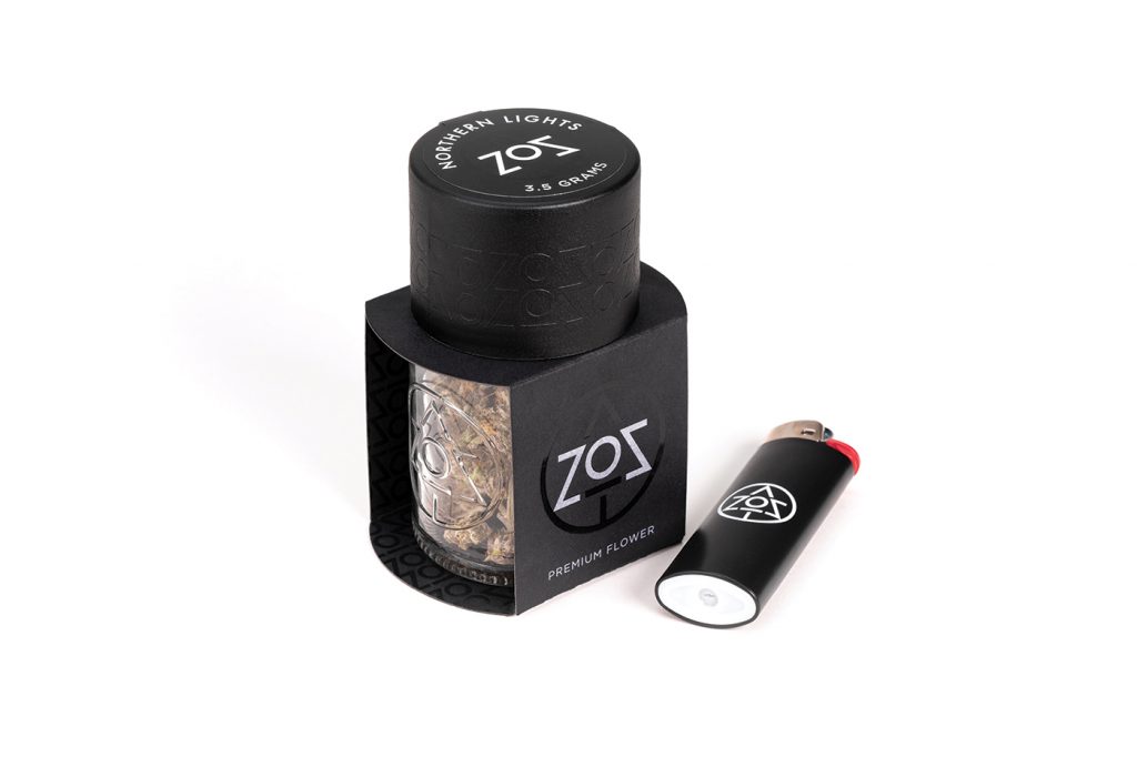
ZoZ
ZoZ had been an established brand for more than a decade when Wick & Mortar redesigned the look, marrying metals with wisps of color to resemble smoke. Sustainability is at the core of the company’s ethos, so the etched glass jars are fully recyclable, including the tops. “Customers can return the jar to the retailer and ZoZ will reuse the jars for future product drops,” said co-founder Natali Schutz.
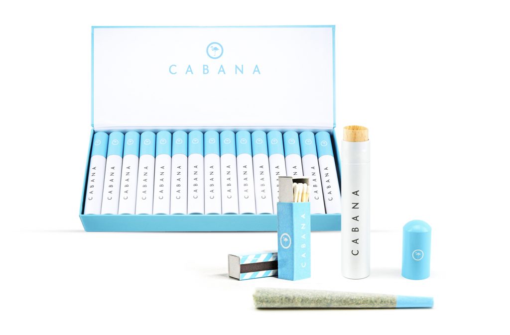
Cabana
Cabana, a pre-roll product from the LTRMN brand house, draws its inspiration from the world of premium cigars. The line’s full-gram pre-rolls are packaged in individual, resealable metal tubes lined in Spanish cedar for freshness and humidity control. The tubes are available to shops in batches of thirty, set into custom Cerulean cigar boxes that function as wholesale shippers and display cases. “The goal is to give the consumer a taste of a premium experience on par with all the other aspirational facets of their life,” said LTRMN Creative Director Jarren Simmons. “Cabana is the luxury you can taste and feel without being pretentious or snobby.”
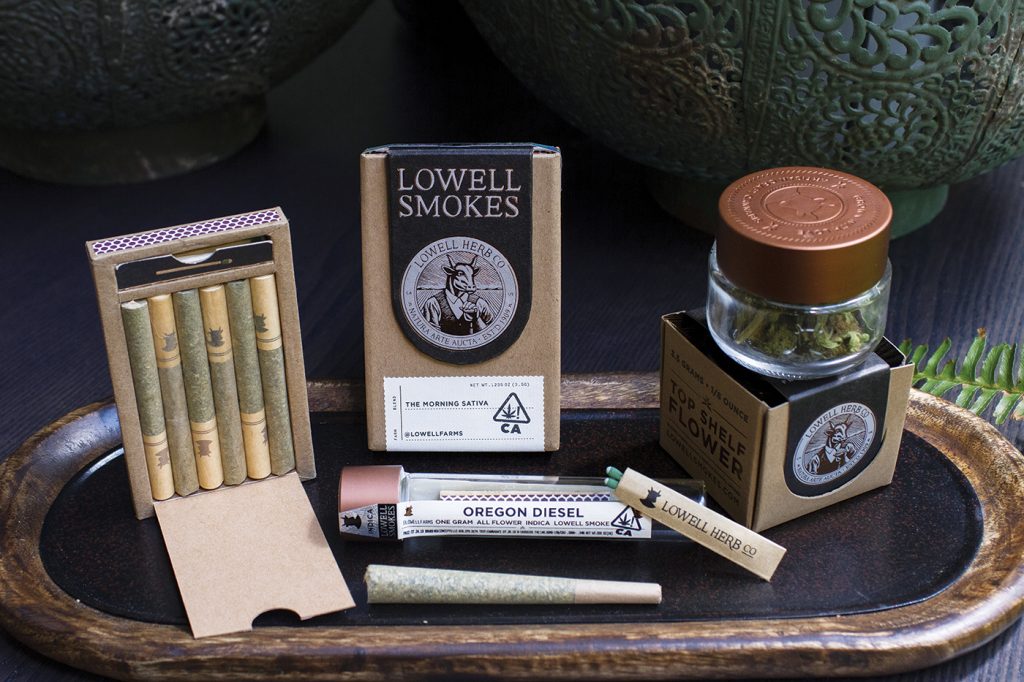
Lowell Herb Co.
“We’re mindful and take pride in the details of our packaging, but how the products function is key,” said Lowell Herb Co. co-founder and Vice President of Product and Design Courtney Zalewski. “Beyond looks, we set out to create an experience that was as convenient as possible for our consumers.” To that end, the boxes in which flower is packed unfold to function as rolling trays for grinding and rolling smokes in an easy-to-use, contained area. Matches and a strike surface also are part of the package. Packaging for one-gram single pre-rolls includes a mini-envelope with two matches and a strike surface.
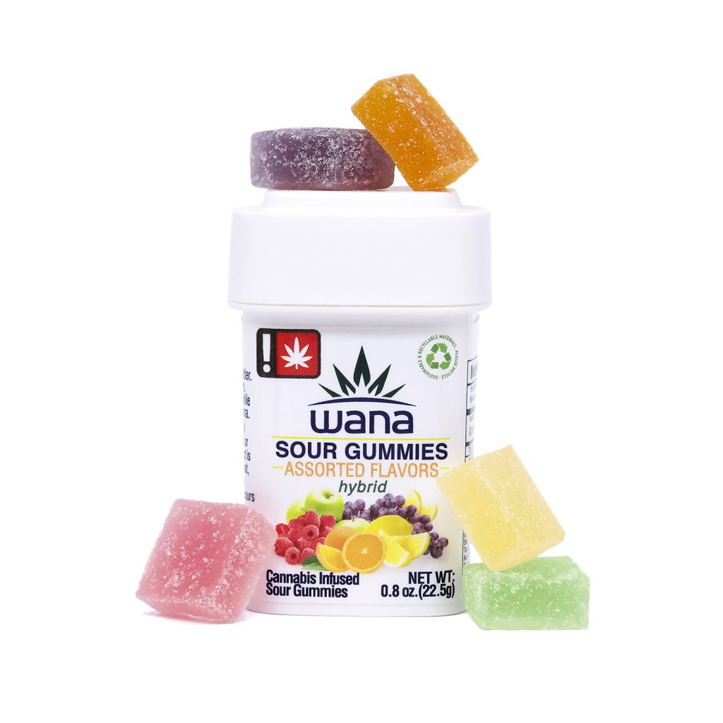
Wana Brands
Previously wrapped in multiple layers of plastic and packaging, Wana Brands unveiled a more sustainable container design for its artisan edibles this year. The new container reduces the product’s footprint by 60 percent, while a new tamper-evident shrink band adds another level of security.
According to Chief Executive Officer Nancy Whiteman, the new packaging, designed by Calyx Containers, has upped the brand’s shelf appeal. “It is innovative and more sustainable, furthering Wana’s brand narrative,” she said.
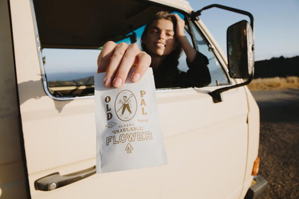
Old Pal
Old Pal’s vintage-looking tobacco pouch format for both flower and vapes gives the brand a familiarity and unpretentious appeal. The packaging, designed by Austin, Texas-based LAND design studio and creative consultancy, is “supposed to pay homage to older times when you didn’t buy weed from a dispensary, but from a friend who showed up at your house with a half pound of weed,” Old Pal co-founder Rusty Wilenkin said. “It’s definitely a throwback brand. We are playing hard on the vintage, old-time feel.”
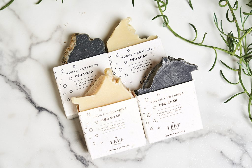
Leef Organics
Leef’s CBD-infused soaps are packaged in a half sleeve that accentuates the handcrafted shapes and is “plant-able.” According to co-founder Emily Heitman, consumers discover, post-purchase, “a better way to recycle, plant, water, grow, and sprout non-GMO, organic tomatoes by planting the sleeve.”
Heitman said the company’s “farm to lifestyle story” demanded a neutral color palette of bone and black mixed with smoky, soil-like amber and rich browns to impart a hand-selected, natal feel.