


Purple Line Media reimagines the brand’s entire portfolio for the new cannabis consumer.
SONOMA, Calif. – Award-winning medical Cannabis pioneer and entrepreneur, Maya Elisabeth, was onsite today at the 2017 Emerald Cup to reveal the new identity, logo and packaging design for her legacy brand, OM Edibles™ (booth T88). It is the first redesign for the brand since Maya founded the all-female collective in 2008.
With recent medical Cannabis legalization in California, Maya sought the expertise of Purple Line Media –California’s premier Cannabis design studio and Cannabis industry specialists – to reimagine OM Edibles’ entire portfolio of high-grade topicals, tinctures and edibles to delight both current and entry-level consumers. The Emerald Cup is the preeminent event for medical marijuana aficionados and draws tens of thousands of attendees from around California and beyond.
Widely considered an early purveyor of high-grade medical Cannabis products, Maya – one half of the Whoopi & Maya™ brand of Cannabis-infused products for women with co-founder Whoopi Goldberg – felt it was time to elevate and broaden the appeal of her heritage brand geared towards the gender-neutral audience.
“Our diverse range of products needed to be unified under one design system, and we lacked a cohesive identity to reflect the quality and intent of the brand,” said Maya.
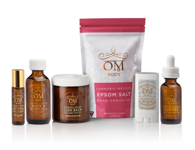
Fans of OM Edibles will notice a dramatic shift in the brand look and packaging, centered on the zen-like appeal of its name. The logo features a stylized OM as the primary visual element, nestled under crown motif with an incorporated infinity symbol, a nod to the brand’s timelessness. Adorning the crown are the three jewels of enlightenment. For the color scheme, gold and white were selected to represent spiritual mastery, enlightenment and awakening – a deliberate departure from the dark tones and mystique commonly used in high-end Cannabis packaging.
“As a longtime premium product, OM Edibles has incredible trust-currency with consumers, so our approach was to elevate all design elements to communicate accessible luxury while staying true to the brand,” said Liz Kost, Chief Executive Officer of Purple Line Media. “The core essence of OM – wisdom, purity and lightness – is expressed in both the logo treatment and premium packaging execution. Taken together, they propel OM Edibles into a new leadership category and shelf appeal.”
A revamped packaging approach by Purple Line Media segregates OM Edibles products into four consumer categories: Superfoods, Elixirs, Edibles and Body. For each category, the base of the design is the gold foil OM logo surrounded by a subtle Sri Yantra pattern using spot gloss treatments on Mylar bags and decorated glass bottles.
“This is an exciting time for the industry and the OM Edibles brand. As a design partner, Purple Line Media understands the cannabis consumer space and issues around new guidelines and compliance,” said Maya. “We hope our customers are drawn to our new look which we feel conveys a level of professionalism, cleanliness, and class in color choice and design.”
OM Edibles will be at 2017 Emerald Cup at the Sonoma County Fairgrounds from December 9-10, 2017. In addition to showcasing a new brand identity, OM Edibles entered three new organic products for Emerald Cup Award consideration: CBD Mangoes, StrawMarys and the Icey Stick, a cooling muscle liniment.
